CLIENT
![]()
PROJECT
Financial data-driven site redesign
Search redesign
MY ROLE
UX Strategy & Experience Design
Lead of Front-End Development
UX ACTIVITIES + DELIVERABLES
Stakeholder Interviews
User Research
User Flows
Sitemap
Wireframing
Front-End (HTML/CSS/JS) Coding
THE
BRIEF
ImpactSpace is a global open database of the impact ecosystem that tracks investments in solutions to environmental and social challenges. The old interface while offering access to the vast resources for the impact investing market was overly complex, had diluted focus and lacked intuitive search mechanism. The challenge was to create a modern responsive solution offering all available impact information in a more structured and digestible way, especially where it involves measurements on social returns, along with a simplified and empowered search mechanism providing a time-saving benefit for both social entrepreneurs and investors.
SERVICES PROVIDED
UX/UI Design
Front-end Development
UI/UX
SOLUTION
One of the essential goals for the website redesign was to improve visibility and positioning for social entrepreneurs and companies, connect them with impact investors and supporting organizations, as well as provide tailored informational resources depending on the needs of the particular group or stage they are at – be it to start, scale, or easily evaluate the impact of social investing.
I was responsible for leading both UX and UI efforts on this project along with delivering most of the HTML/CSS/JS screens to the development team in India who were responsible for the back-end programming tasks. The existing – at the time – site was highly technical and confusing, with a plentitude of resources in different formats added at different times that were time-consuming to locate and even harder to navigate. My initial instinct was to focus on finding a way to simplify the site structure and the navigation logic. To reduce the number of steps (and screens) for users to get to the information they would be looking for. To distill it down to an intuitive search-based interface that would make sense to busy people. To make the content easier to digest and share across all media platforms.
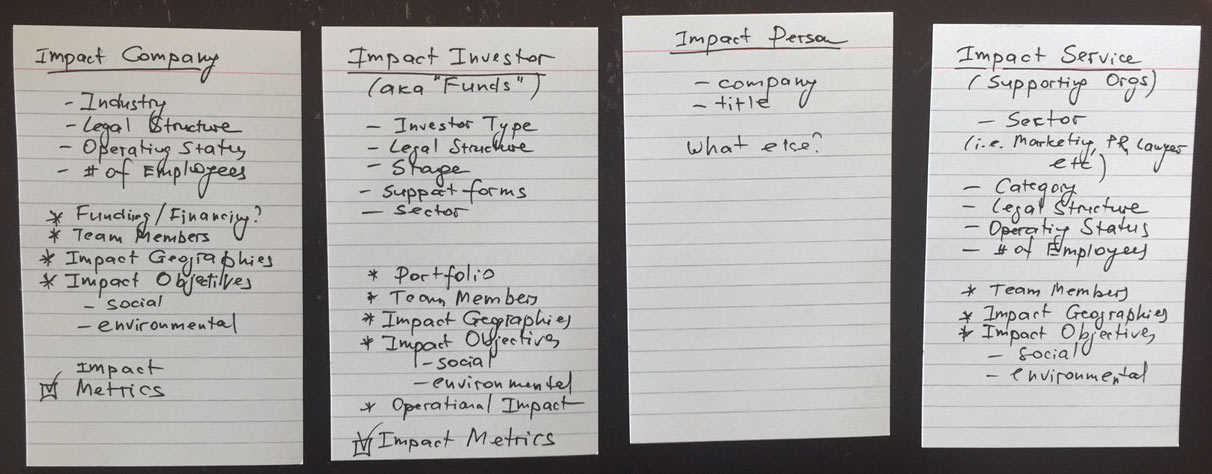
Taxonomy-Driven UX
Considering the copious amounts of data already present in the database, we decided to make sure that its structure is sound enough to withstand the challenge of time. This called for a single managed taxonomy that would guarantee that the site could scale to large amounts of content and would ensure a consistent user experience throughout the site.
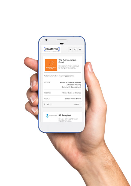
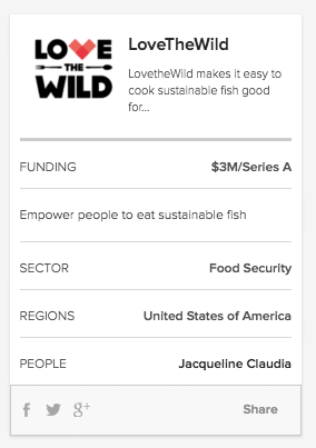
Introducing Card-Based Interface
After talking to the stakeholders and the team, we decided to create and test a new card format for each type of social investor or impact service, that would be easy to locate and even easier to embed into other sites or share on social media. Such a card format would become a new structure block for the new site.
Exploring and Testing Different Card Options
Once we agreed on the elements and overall layout of the card, I started iterating its possible layouts. It was critical to figure out the types of information to include about each entity without overloading the small space with non-essential details but not disregarding its findability and ease of classification.


Contextual Onboarding
No one likes to waste time filling in long forms just to get to see what’s the site is about. We decided to give a try to a very contextual way for bringing users in – leading with meaningful content. So that the users would know what to expect once they are ready to add their impact entry to the database. Or edit it, if it’s already there. The challenge was to make the entire process as natural, quick and painless as possible.
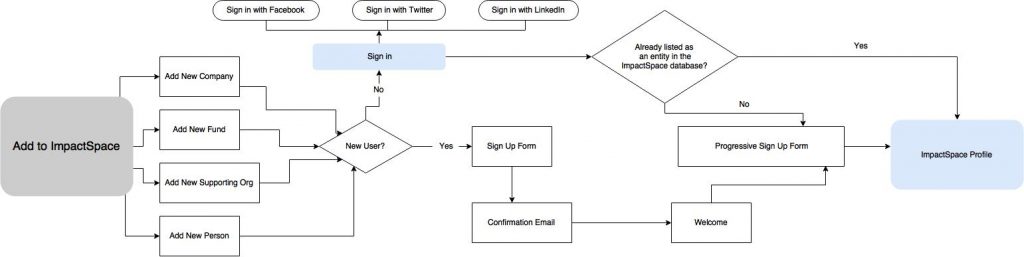
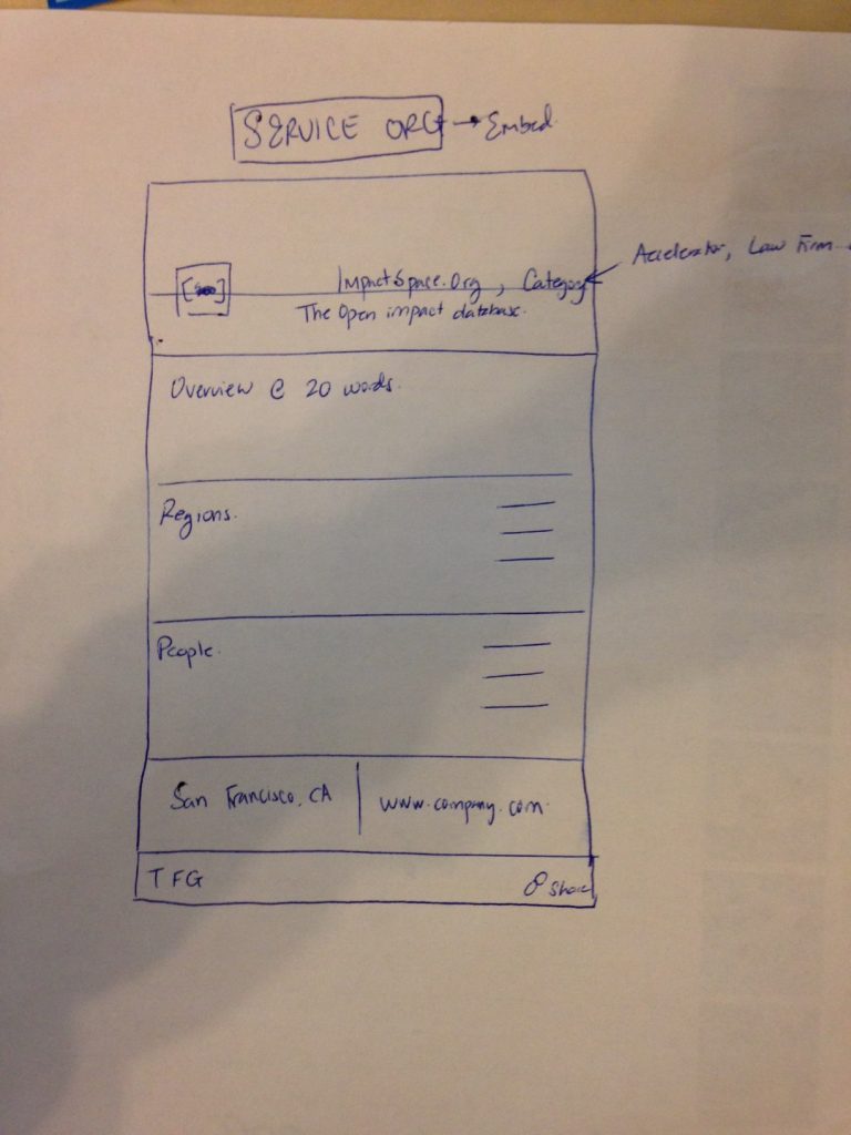
Wireframing
Once we had the taxonomy down, stakeholders’ sign-off on using card-based presentation style for the impact entities and agreed to test the contextual onboarding, it was time to focus on the prototyping.
The old site was not a responsive one, and the need to replace it with a mobile-friendly solution was a very pressing one. The initial user testing confirmed that while they got used to the layout of the existing screens on the old site, their main trouble was in finding new content, as well as their inability to properly access the information on mobile devices. I suggested going with a Bootstrap framework as one of the most popular in the world responsive HTML/CSS/JS frameworks for a foundation of the new site’s front-end design.
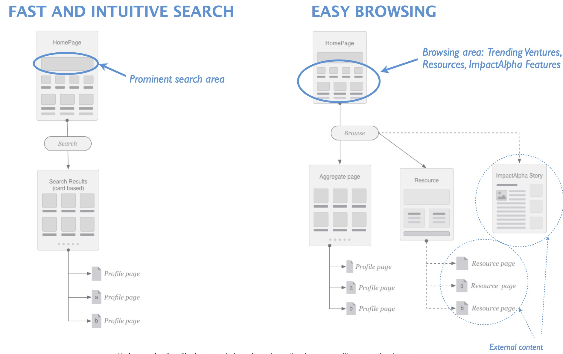
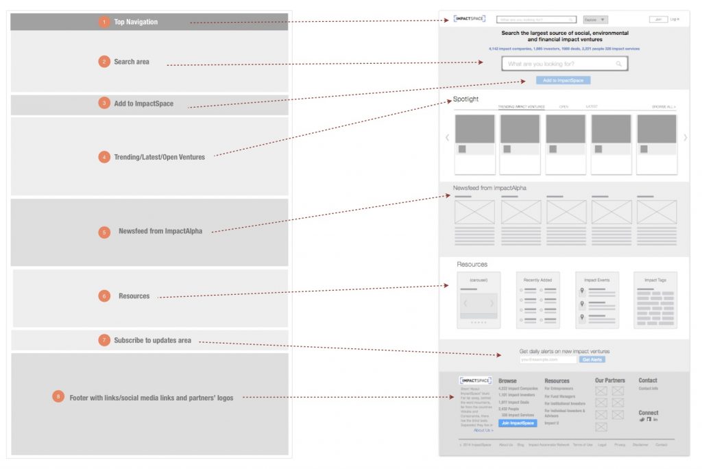
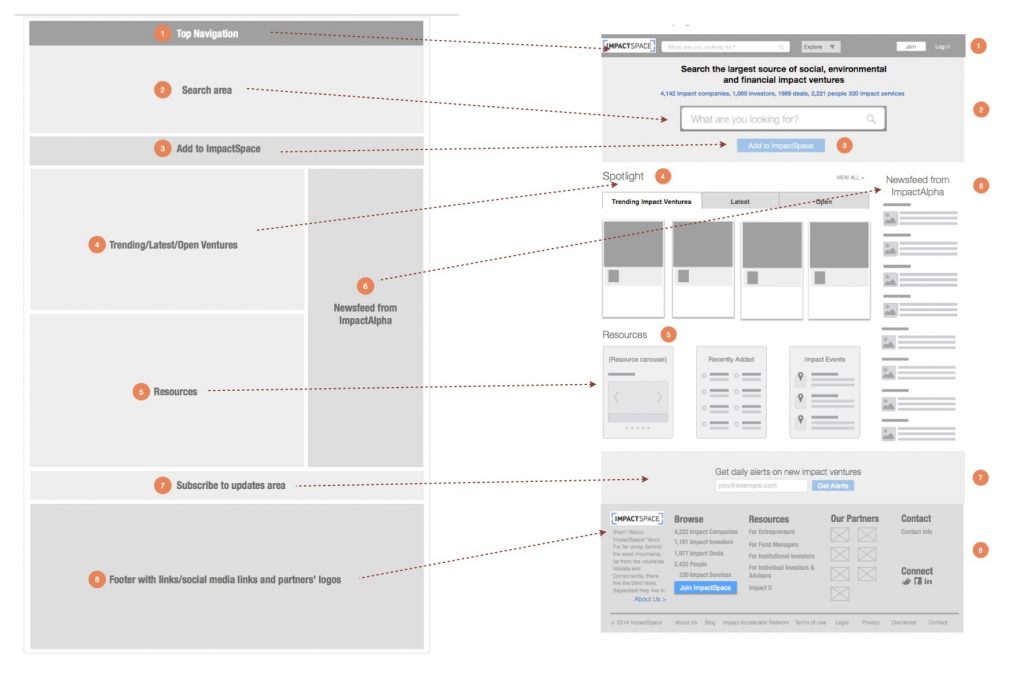
With these considerations in mind, the wireframing has begun. To make the long story short, we tested many layouts of the homepage and the ones with the prominent search bars/search areas came out as winners every time. I also introduced the card-based entity presentation on the homepage as well, along with different treatments of the resources areas.
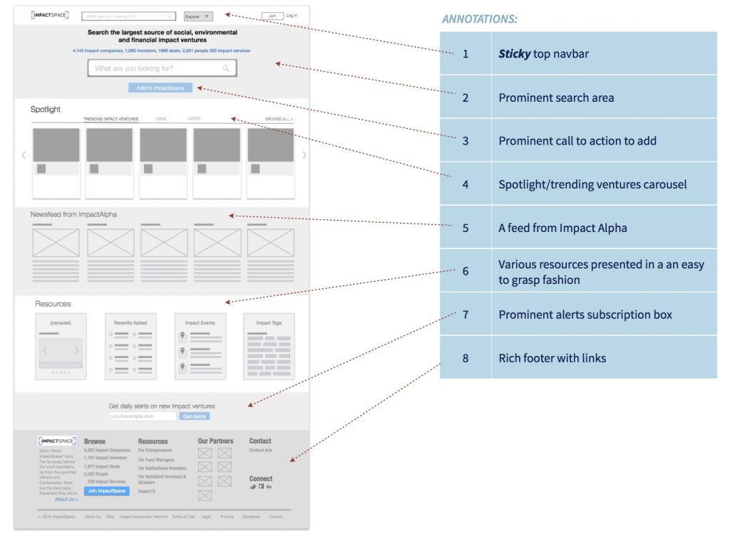
Every element of the site was iterated and thoroughly validated internally and externally.
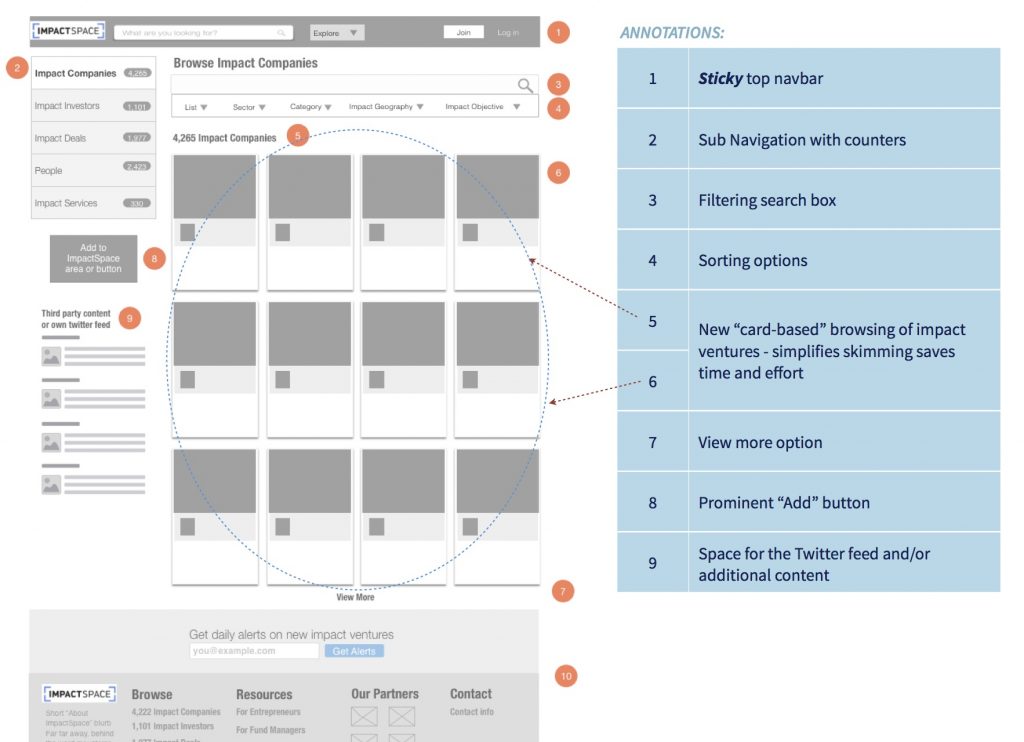
Considering the introduction of the card-based system might have come as a surprise to the existing users, we made sure to think through the sorting and filtering options so that the value of the change was immediate even to those who weren’t expecting it. We contemplated for a while on a choice between a grid system (new) and a list system (old), and decided to keep them both and let the users switch to the list if they so desire, but making the grid a default choice.

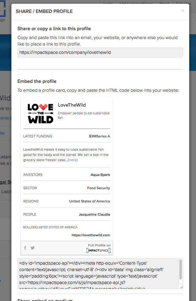
Another challenge was whether to keep the “card” itself on the company profile screen (to illustrate what an embed would look like). In the end, it came out as “confusing” to the users, so we moved the card directly to the modal window along with an actual embed code.
Company Profile Screen
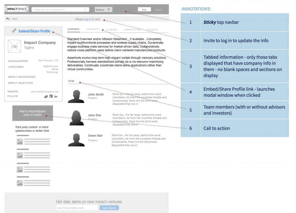

User’s journey from clicking on a card to the impact company profile to its embed (and sharing)
"Card"
Company Profile
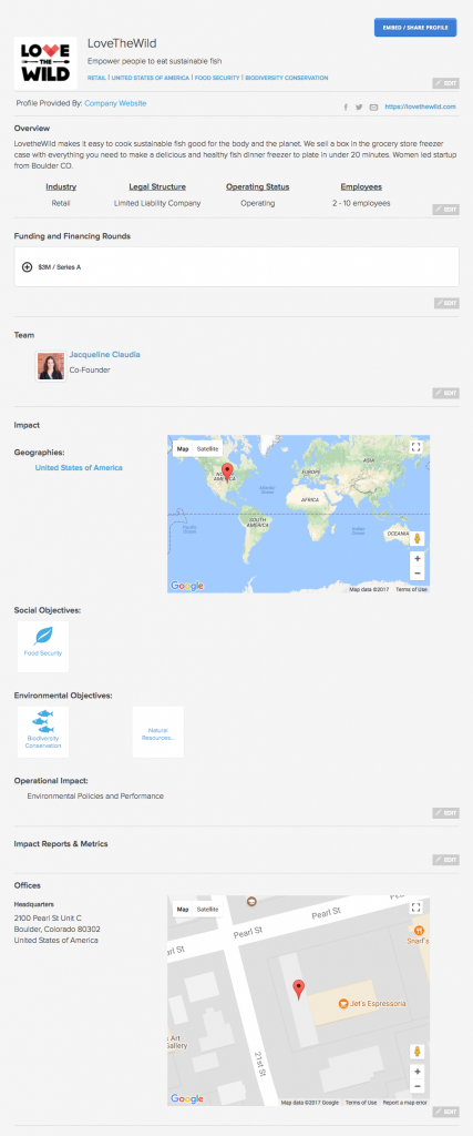
Embed
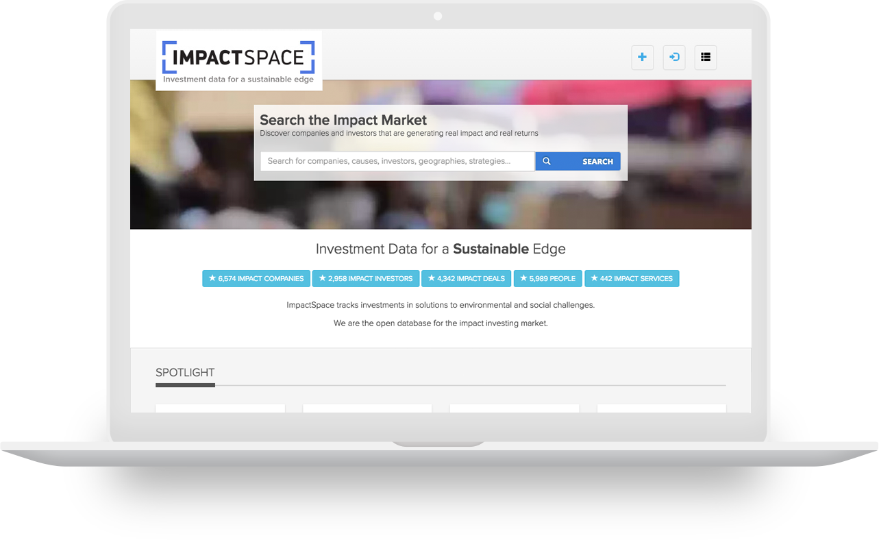
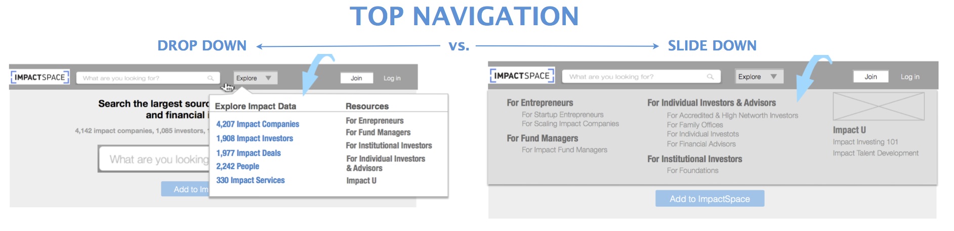
Designing Search
Search is a vital element on any modern site, but especially on such a complex and content-heavy one as ImpactSpace. And this is why it was so important to get it just right, without adding frustration or cognitive load to the already busy users.
For the homepage, we iterated and tested more than a dozen of search box designs varying in their sizes, positioning, and language before finding a winner that created the best response rates. Besides the prominent position on the homepage, the winner contained a large open text field, a separate search button, hints such as “search for companies, causes, investors, geographies, strategies…” within the textbox itself making it clear what users can search for and a useful auto-suggestion mechanism.
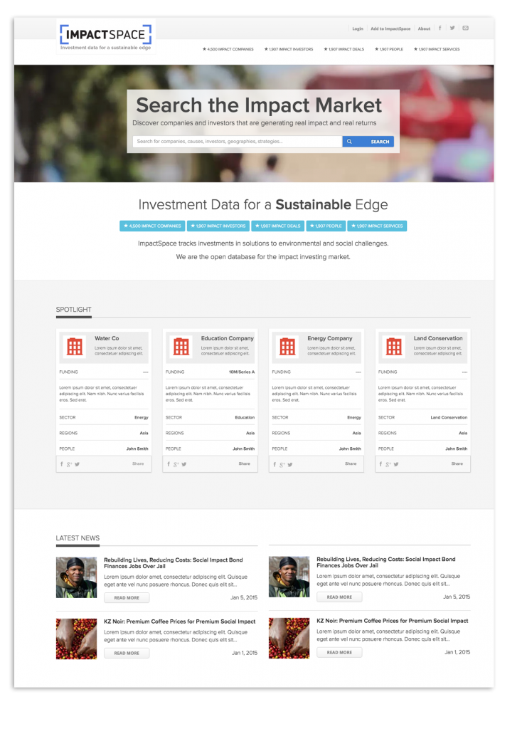
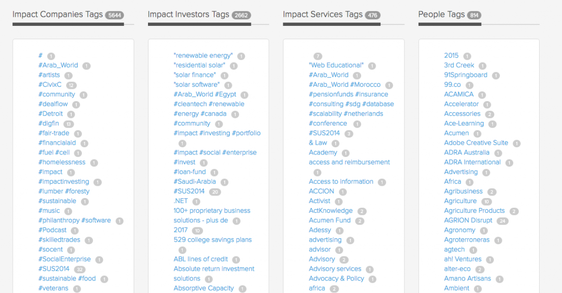
Faceted Search
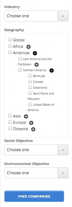
Alphabetized and categorized tagging system is another way to bypass the sequential exploration if the users have sufficient detail on what they’re looking for.
Final thoughts
Redesigning user experience and the site itself for the company collecting and creating deep useful market data on social impact-focused funds, businesses and the people running them has been incredibly insightful. Despite its recent appearance, impact investing is quickly becoming a norm and facilitating the online connections between the wealth managers and socially-impactful businesses presented its unique challenges. I attempted to simplify and “move things out of the way” as much as possible, but of course, there is much still left to do and while I’m mostly satisfied with the improvements we already made, now looking back at it, I see definite ways to improve usability and experience further.