This innovative ring configurator exploration was a part of the full site redesign project, following in the footsteps a separate navigation redesign project.
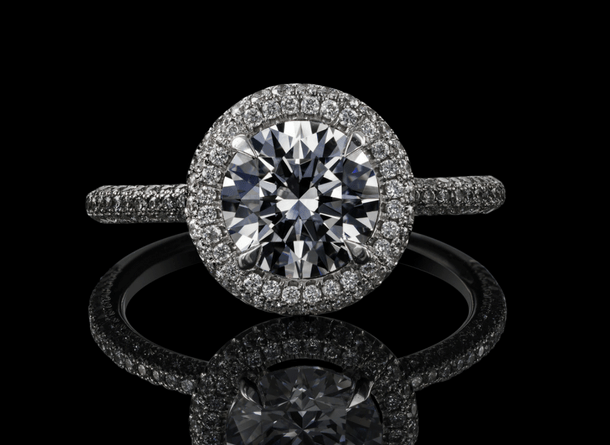
"Your relationship is unique, so your 💍 should be too... there are custom rings for every occasion at Helzberg Diamonds."
After more than 100 years of successfully selling a wide range of diamond jewelry, Helzberg had a long list of established norms and practices. Yet, they knew they needed to stay relatable to the younger customers and their buying preferences. Capturing new prospects early in their lives, literally with their first serious jewelry purchase – a unique, fully customizable ENGAGEMENT RING – might create a solid foundation for lifetime loyalty to the brand.
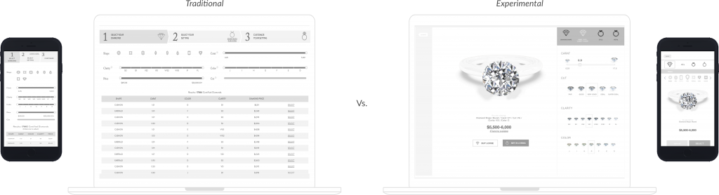
Given the importance and business impact of the task, we [BORN UX team] decided to work on the engagement ring customizer in two tracks – traditional and experimental.
I was put in charge of creating an experimental variation.
THE CHALLENGE
Can we make it simpler?
If you ever tried to “build” a custom diamond ring online, you would probably remember it as an overwhelming and somewhat intimidating experience; the diamond choices are usually presented in a long table format consisting of letters and numbers and prices… Many filters and values are unclear to a non-expert, and will often require considerable domain knowledge to fully understand and select among. However, if users don’t fully understand a filter type or its filtering values, applying them appropriately will be difficult, which was observed to be both a direct and an indirect cause of the site abandonment.
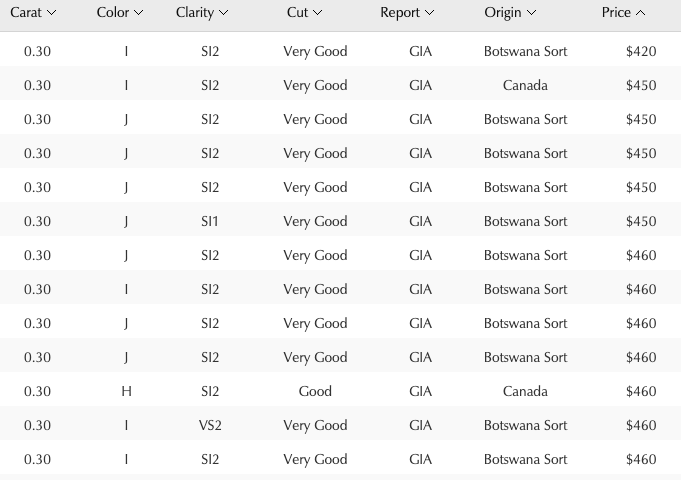
A small sample of the usual ring configurator table.
There must be an easier and more exciting way to create this symbolic ring, right? And this is exactly what I was tasked to find.
THE GOAL
To design a "no learning curve" engagement ring configurator - easy to use for a jewelry novice, yet full-featured and appealing even to a jewelry connoisseur.
THE APPROACH
Let's start with the users
Armed with the research and insights gathered during the earlier navigation redesign stage of the project, I focused my attention on the primary users of the future configurator. Out of 5 proto-personas created by my team members, the surveys have shown that two – First-time Frank and Browser Beth – expected to be primary users of the ring configurator.
A quick reminder on proto-personas:
Proto-personas
Proto-personas are fictional characters that are used to represent the different types of customers who interact with client’s brand. They help us better understand customer goals, needs, feelings, influences, and frustrations. We benefit from proto-personas by using them to better understand who we’re designing for and to inform our decisions of how to create their experience.
PRIMARY PROTO-PERSONA SUMMARIES
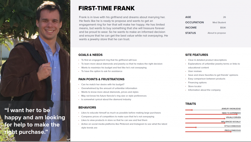
First-time Frank
About to propose, knows little to nothing about jewelry, anxious, overwhelmed with variety of options available, afraid to make a wrong choice, on a budget but considers this important purchase an investment and is willing to spend more or finance it.
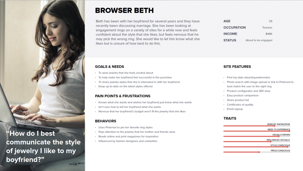
Browser Beth
Knows and loves jewelry, keeps up with trends, may spend hours online designing an engagement ring of her dreams, confused about how to convey her “ideal ring” design to her future fiance.
Most industry-standard ring customizers would appeal to Browser Beth significantly more than they would to First-time Frank due to their perceived complexity, a myriad of parameters laid out in a table format with limited visuals – implying an obvious learning curve – which may scare away a novice like Frank.
For both – First-time Frank and Browser Beth – designing an engagement ring is an emotional act associated with thoughts about the person they love and imagining the future together.
The engagement ring they are designing becomes a symbol of this future.
Thus, we decided to make the experience as visual and emotionally charged as possible with the ring itself playing a literal leading role in the configurator.
DESIGNING FOR EMOTIONS
Falling in love ... with the ring
Many studies in psychology reveal a tight connection between affect and cognition: emotions are essential in human thought and decision making. Emotions guide social interactions, influence basic understanding and may even control physical actions. When we feel good it is easier to be creative and make decisions. Attractive things really do work better.
Hence, high-resolution, realistic visuals would play a crucial part in helping users to fall in love with the ring while they are building it… which will translate into an increased conversion rate.
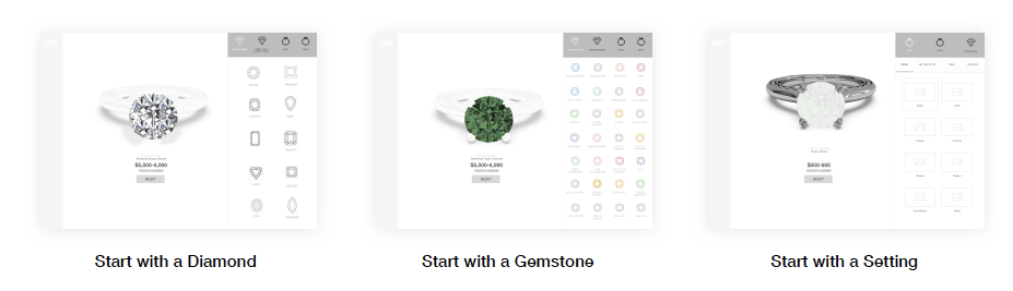
As per the client’s request, I was creating three variations of the configurator to illustrate three distinct entry points allowing for the variations of the journey:
- “Start with a Diamond…”
- “Start with a Gemstone…”
- “Start with a Setting…”
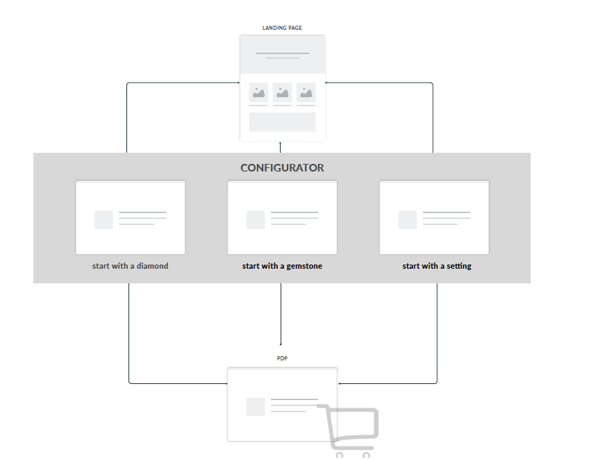
Depending on the entry point, only a corresponding part of the ring is expected to be “fleshed out”, leaving everything else to appear as “clay” and suggesting that they will need to be built out later.
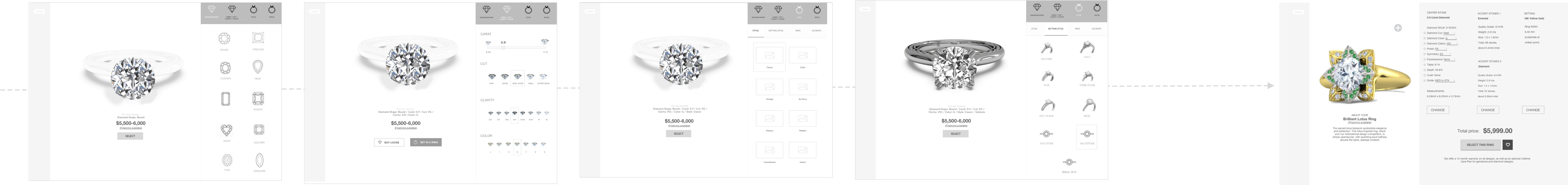
All three entry points
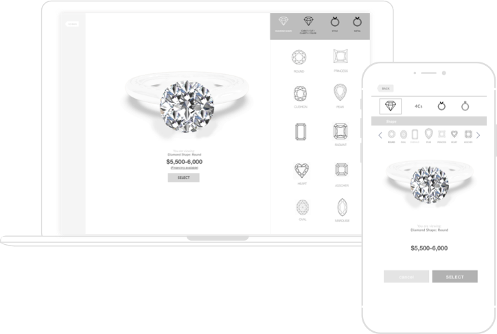
DESKTOP VIEW
The Structure of the Configurator Window
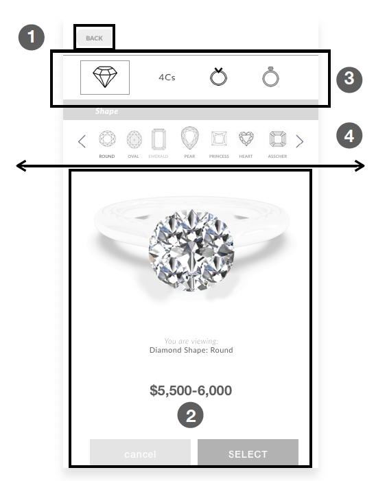
“Start with a Diamond…”

1
“Back” button that takes a user back to the location they came from (i.e the configurator landing page, located OUTSIDE of this configurator)
3
Configurator Navigation Bar. Options available there and their sequence will vary depending on the entrance point into the configurator. This navigation bar stays “sticky”/fixed in this position on the screen at all times. May include a sub-navigation where necessary, which would also stay “sticky” on the screen and always available to the user.
2
Viewing Pane where a ring is being built. Stays “sticky”/fixed on the screen at all times.
4
“Options” area – where the selection is being made. In cases where more options are present than the height of the screen, this area/list of options becomes scrollable and slides under the navbar.
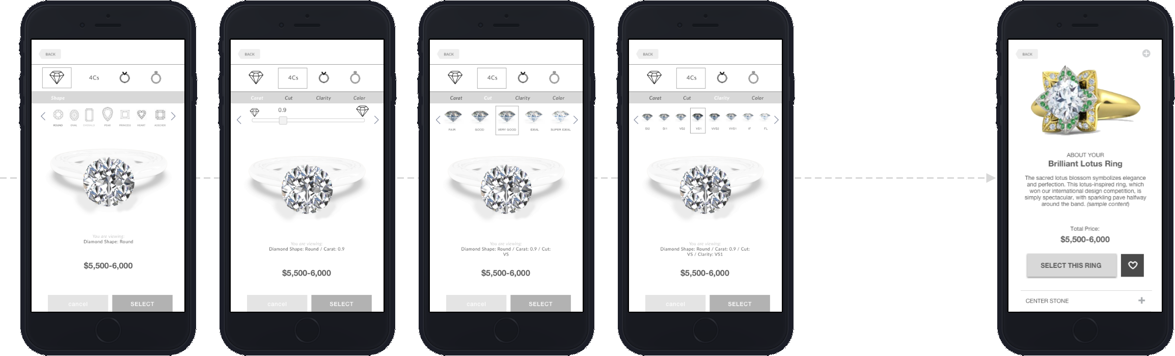
As a user continues adding elements to their ring, the configurator smoothly takes them to the next element to be customized, keeping the ring that is being built in front of the user at all times. They see THEIR ring fleshing out more and more right in front of them with no learning curve and a lot of options to explore, all while keeping their eyes on the ring.
Translation to Mobile
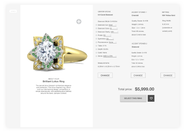
After a user has chosen enough elements to complete the ring, the “Select” button on the configurator screen is automatically replaced with “Finalize the ring”. When this happens, a user will still be able to go back and forth to keep changing any element they wish. Or, they may proceed directly to the “Review the Ring” screen below where they see not only the ring itself, but all the attributes of their newly designed ring displayed right next to it. Some attributes can be fine-tuned on this Review page (especially some attributes of the diamonds, such as Polish, Fluorescence, etc)
We removed all “distractions” (such as site header, footer, etc) from the configurator that don’t directly contribute to the experience of designing a ring in order to fully focus the user’s attention on their creation.
Following this approach, a ring never leaves the user’s sight which helps strengthen the emotional bond between the user and the ring, and create a deeper attachment to the product which, in turn, would translate into higher conversions.
It is also very important not to get fooled by the superficial simplicity of the interface. It provides access to all same features as “industry standard” table-based configurators, but in a simpler to understand and process model.
CONCLUSIONS
The results are in
Despite the overwhelmingly positive feedback during the side-by-side gorilla testing of both prototypes, the client decided to go with the traditional “industry-standard” option feeling that the experimental one was too risky. Yet, they are still considering to develop it at a later date with some modifications.