This navigation redesign was a “pilot” project followed by the full site redesign, which included a ring configurator exploration.
Helzberg Diamonds is a jewelry retailer founded in 1915 by Morris Helzberg that now has 210 stores in 36 states, and a revenue of $550M.
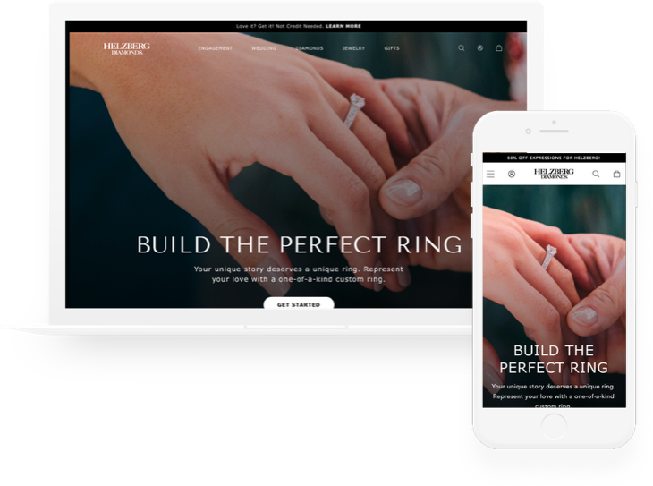
Helzberg Diamonds has long been a destination for wedding jewelry. With mall traffic declining and online shopping options increasing, the 100-year-old company needed to bring attention to the Helzberg brand as champions of modern love. Helzberg started to re-position their company as an omnichannel brand, began focusing on building a true connected customer experience between their online and offline presences. For the company widely known for its exceptional product quality and superb on-location customer service, this switch in service model did not happen easily. Stakeholders began to realize that this change will require an extensive redesign effort, where the navigation re-structure would be the first, much-needed step.
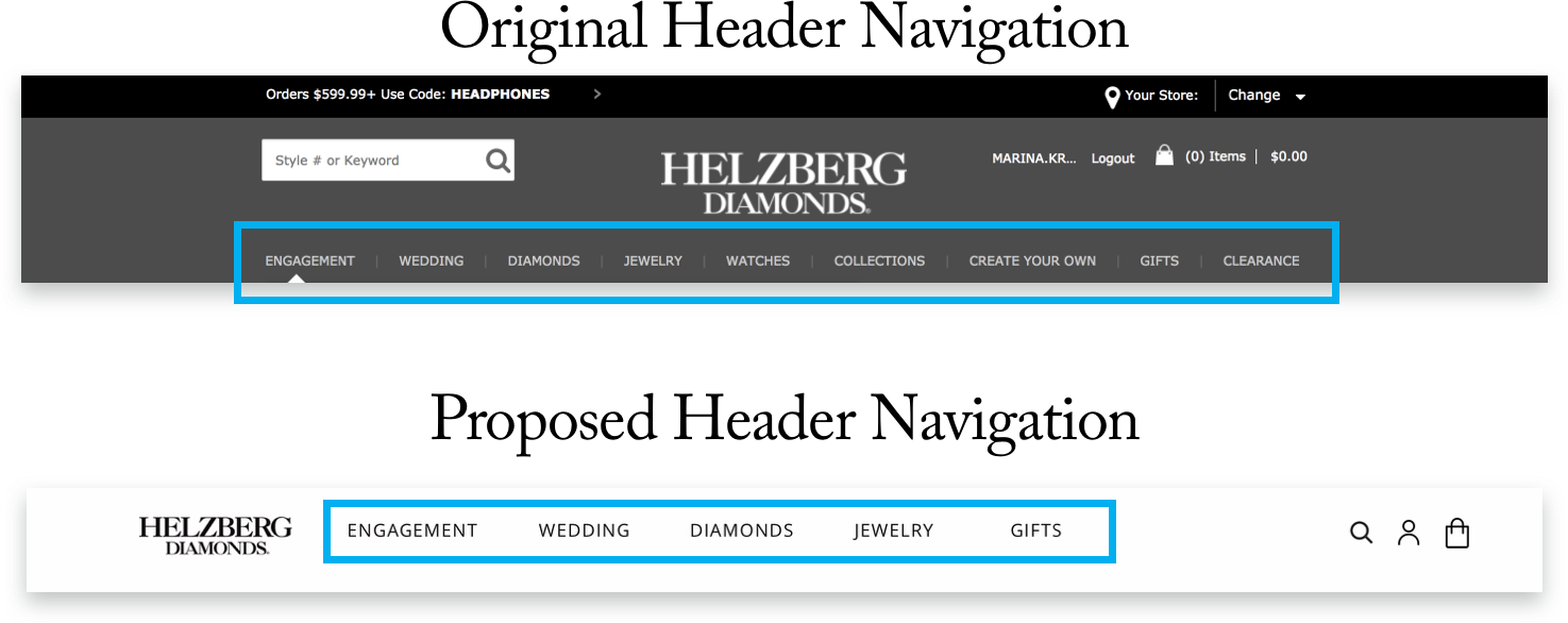
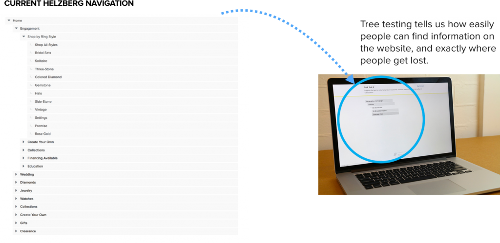
Original navigation
Navigation plays a major role in shaping our online experiences. It provides access to the information in a way that enhances understanding of product offerings, reflects the brand and lends to the overall credibility of a site. And ultimately, affects the business bottom line.
PROBLEM
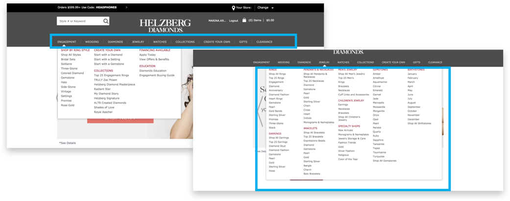
Over-categorization = user frustration
The original Helzberg Diamonds site suffered from overwhelming navigation options containing an excess of information. Many links in the mega menus were duplicated (i.e. “Collections” label appeared at least in three of the original sub-menus and meant different things every time.) Mega menus were massive and unwieldy, which made users struggle to locate links they needed to accomplish basic tasks, and in the end, negatively affected performance.
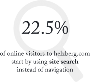
Studies show that visitors rely on navigation for wayfinding first because it’s easier and faster to click/tap on links – especially on mobile – than to type in search strings. Most people only use the search feature after they’ve tried the navigation or the content links.
But with 9 main navigational categories and more than a 100 of displayed "sub-categories", not surprisingly, a substantial portion of Helzberg visitors resorted to search right away instead of trying to understand the "logic" of the navigation.
Goals of the Navigation Redesign
Redesigning navigation was largely about increasing and maintaining confidence as users move through the site. The key elements we focused our attention on in creating this certainty:
- Information Organization – the categories and groupings of navigation options need to clearly communicate the intent of a menu and to reflect clear revised taxonomy.
- Labeling – as users quickly scan navigation for trigger words, creating good labels was critical for creating good navigation.
- Appearance – the layout and presentation of the navigation needed provide valuable clues to its use and understanding of the navigation logic.
The redesign was ultimately about creating a flow through the site – a narrative that users can follow.
PROCESS
Planning it out
I began by laying out the plan that included assessing the current web experience, interviewing stakeholders, conducting usability tests and iterating based on the outcomes. Always keeping in mind that in order to improve performance, we will need to spend time figuring out how Helzberg customers interact with content, and find the most natural way of organizing, and representing it.
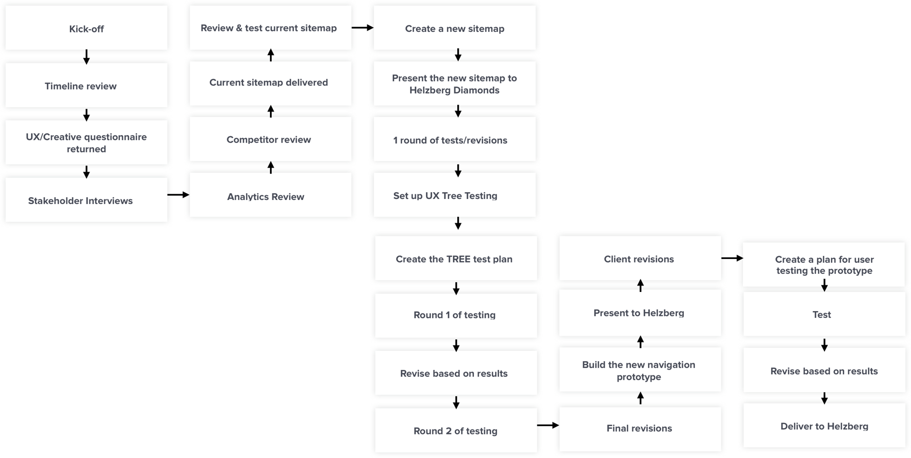
GATHERING INSIGHTS
Assessing the Current Web Experience
To better understand business goals and the current state of affairs, prior to the kick-off meeting, we asked Helzberg stakeholders to share their insights and opinions–
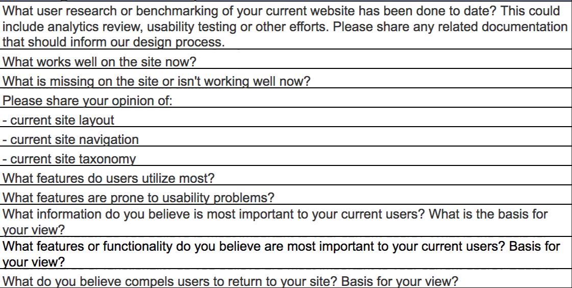
…etc.
GATHERING INSIGHTS
Baseline Analytics Assessment
Designing an inclusive and engaging experience involves understanding user behavior and their expectations. After reviewing Google Analytics (April ’17 – April ’18), we have gathered the following quantitative insights about the customers and their preferences —
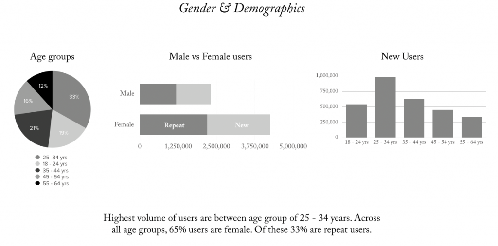
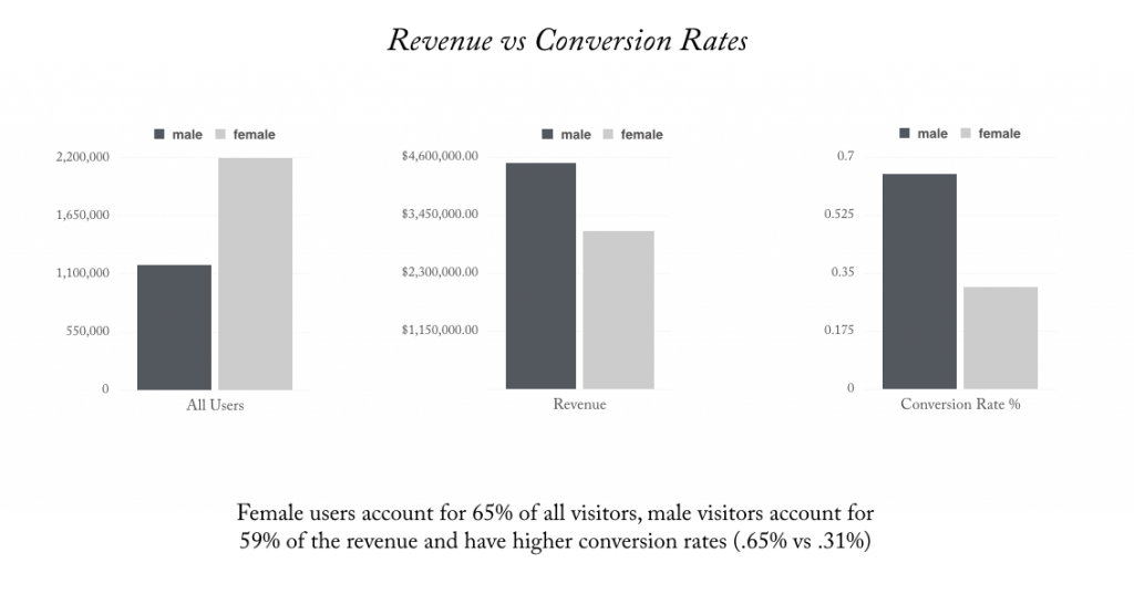

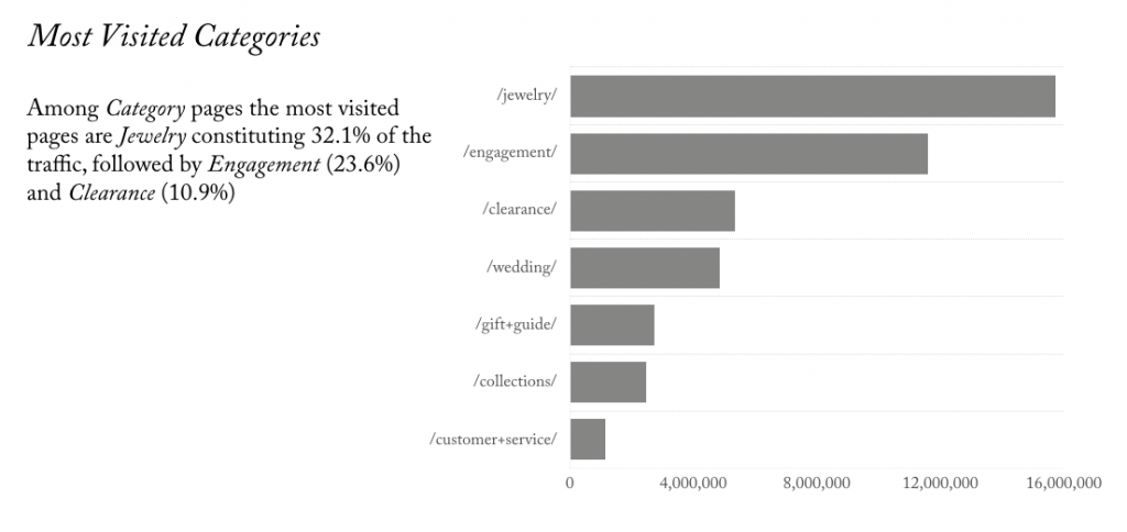
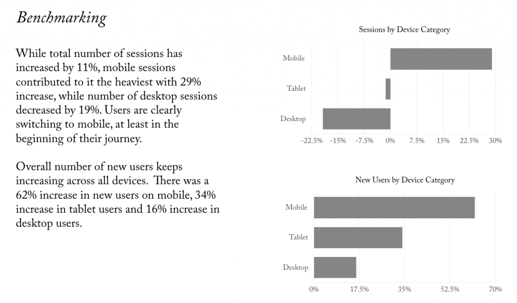
Indicative analytics suggest that the core users are getting younger and interact more frequently. Having a seamless responsive site is crucial, as they will make multi-device journeys become more predictable and easier in assisting task completions and conversions. Category labels need to be uncomplicated and landing pages have to target surface good functional information. Establishing an identity and experience consistent across mediums will provide opportunities for more focused engagement with Helzberg Diamonds brand.
PROTO-PERSONAS
Who are the key customers?
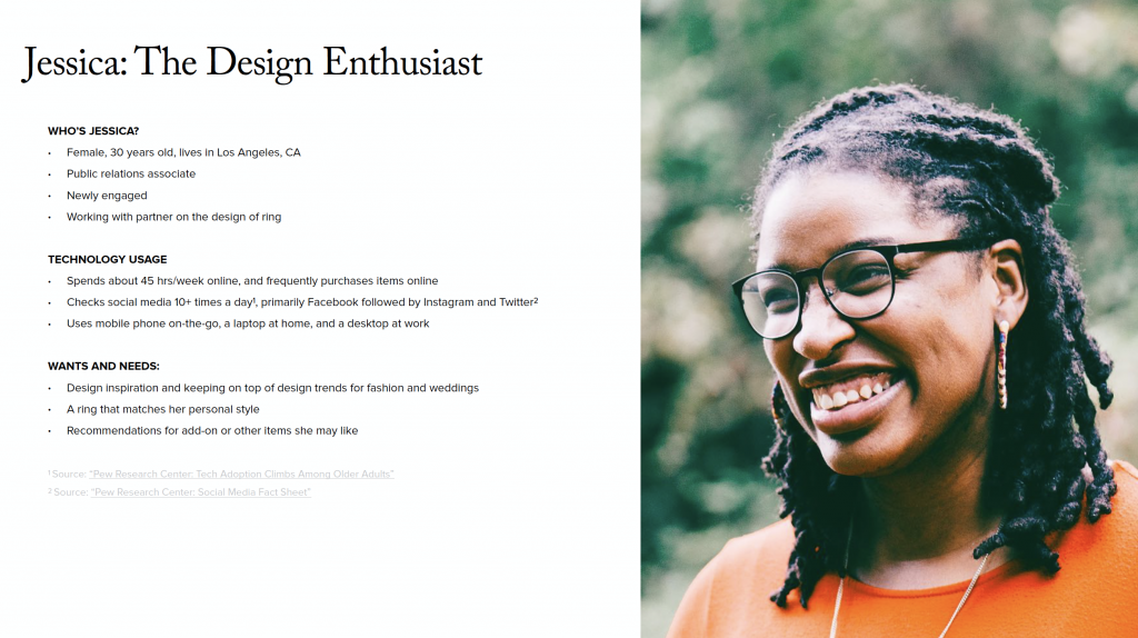
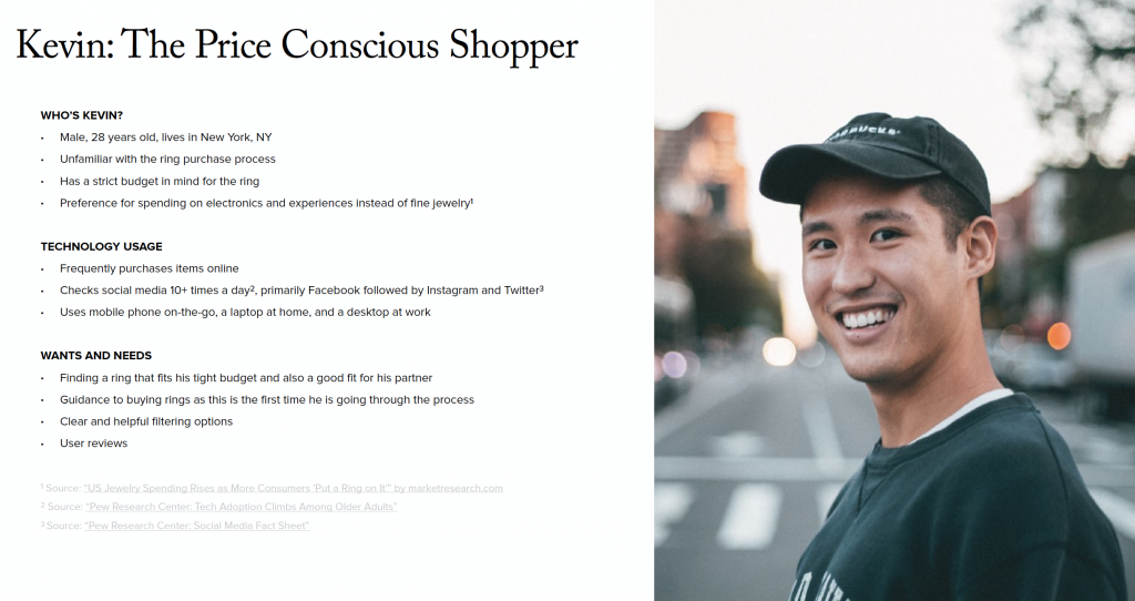
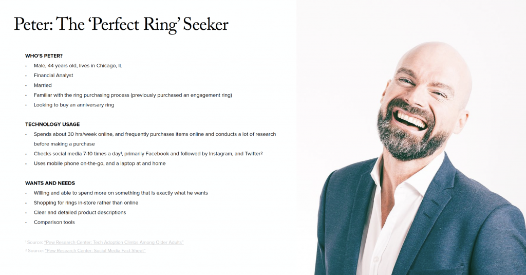
Even though we did not have a budget to create proper research-based personas, we put together three basic proto-personas – fictional characters that were used to represent the different types of customers who interacted with the brand. These were based on our analytics assessments, stakeholder insights, and other online research available. These proto-personas helped us better understand customer goals, needs, feelings, influences, and frustrations. They were refined and modified during the later – full site redesign – stage of the project; but as far the navigation redesign went – these three archetypes were the ones we used to validate our assumptions.
GUIDING PRINCIPLES OF CONSUMER EXPERIENCE
What do e-commerce customers want?

Personalize it
The ability to personalize a product lends itself to a greater sense of ownership over the product. Since consumer psychology is unlikely to change, being able to offer personalized products does seem worth the investment.

Help me find it quickly
According to a Nielsen Norman Group study, navigation was used more on mobile than on desktop. What this means is that we need excellent navigation, search, and easy add to cart options so we can get these highly motivated and goal oriented users to what they want quickly and easily.

Educate me
Users need a lot of information in order to make decisions. It helps them know they’ve made the right decisions. According to Nielsen Norman Group studies, 20% of the users fail to successfully complete a purchase when asked to do so as a result of incomplete or unclear product information.

Inspire me
Millennials value experience over ownership, so inspirational and lifestyle photography are critical to romancing them and winning them over.

Earn my trust
Millennials are willing to pay more to support causes that are important to them, and brands who share them. They value integrity and craftsmanship and are redefining the definition of luxury as a
result. Customers care about the brand partnerships that they are buying into.

Make it easy
Recognize me, everywhere + Easy access to Customer Service of my choosing, chat, call, text. Expert advice from brand and the community + Fast delivery + Seamless checkout, e.g., Apple Pay. View options from the PLP.
INDUSTRY TRENDS & CONSUMER INSIGHTS
What do jewelry shoppers want?
Ring shoppers prefer in-store shopping, but use the Internet to research.
Nearly 90% of millennials browse for diamonds online before buying. This means the digital experience has to be informative and easy-to-use since research is an important part of the user journey.


Documenting and sharing the proposal with others is the new normal.
62% of shoppers posted a picture of their engagement ring or engagement to social networks to announce it to their friends and family. Moreover, it’s become important to capture the proposal on camera with 47% of proposers claiming to have a photographer or videographer on the scene – adding more pressure to buy a ring and ensure the ring looks ‘perfect.’
Customization adds a personal touch to a typically traditional occasion.
It’s not just about having a big diamond anymore. 45% of grooms had their engagement rings personalized in some capacity, to ensure the cut and shape of the stone, in particular, meet their wants and needs. Custom jewelry is not just about reflecting the customer’s unique personality, but it is also about creating something that’s never been done before.

COMPETITOR REVIEW
Who is Helzberg competing with?
During the informal competitor review, we conducted the heuristic evaluation of the competitors’ sites, paying special attention to their approaches to navigation, specifically product groupings, labels, use of iconography and navigation layout.
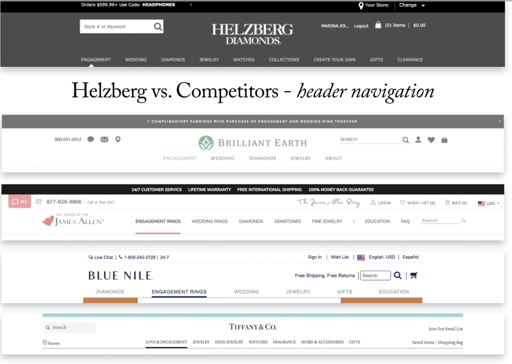
Observations:
All competitors focus their global navigation around fewer top-level categories; avoid long lists of links, diving them instead into easy to understand intuitive groupings of 5-6 items each; rely on icons and other visual cues for silhouettes of the diamond shapes, stone settings, metal/material and gemstones; and have reasonably sized mega menus, never reaching the bottom of the screen.
REVISING TAXONOMY
Categories vs. filters
The taxonomy should obviously be logical, but it should reflect what is logical to the average user of the site, not the site employees. Also, we decided to pay special attention to when something should be implemented as a product type filter instead of a category (the issue of over-categorization), Once we started thinking about clarifying taxonomy, we compiled a list of questions needing answers–
- What would be the best top-level buckets?
- What categories & subcategories needed to be renamed or combined? Could any categories be better represented as filters instead?
- What would be the best top-level category labels?
- Would users value educational content? If so, would they prefer it in a separate category or inline with product information?
- Do users easily understand the difference between product information and educational content?
- Should the navigational groupings we organized by feature or by value?
- Should the navigation be more audience segment-centric or action-centric?
Research suggests to use product type, brand, collection and style as filters instead of categories when product attributes are the same across the classification (and therefore shouldn’t be mutually exclusive). So, based on the existing industry standards, previous research and customer surveys, we decided to reduce the original 9 top-level categories to 5 most important ones–
Engagement, Wedding, Diamonds, Jewelry, and Gifts.
We proposed to turn Clearance and Collections into filters (these two could serve as product attributes and could be applicable to multiple categories and as such, would serve better as filters).
Watches represented s small <1% portion of all purchases, and as such did not require to be a top-level category.
Create Your Own is an engagement ring configurator and as such would be expected to be found under Engagement.
All these refinements allowed us to make the global navigation more focused on the products customers expected to find on Helzberg site.
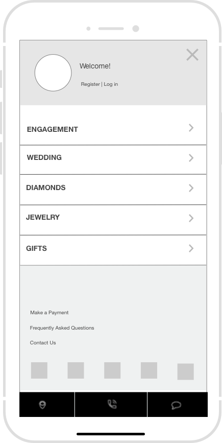
Revised mobile navigation
REVISING NAVIGATION
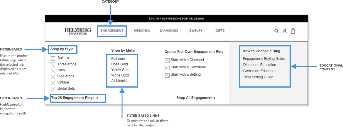
Proposed Flyouts
Navigational links have been grouped logically, based on the user’s primary activities, usage frequency and the paths users will take to accomplish various tasks.

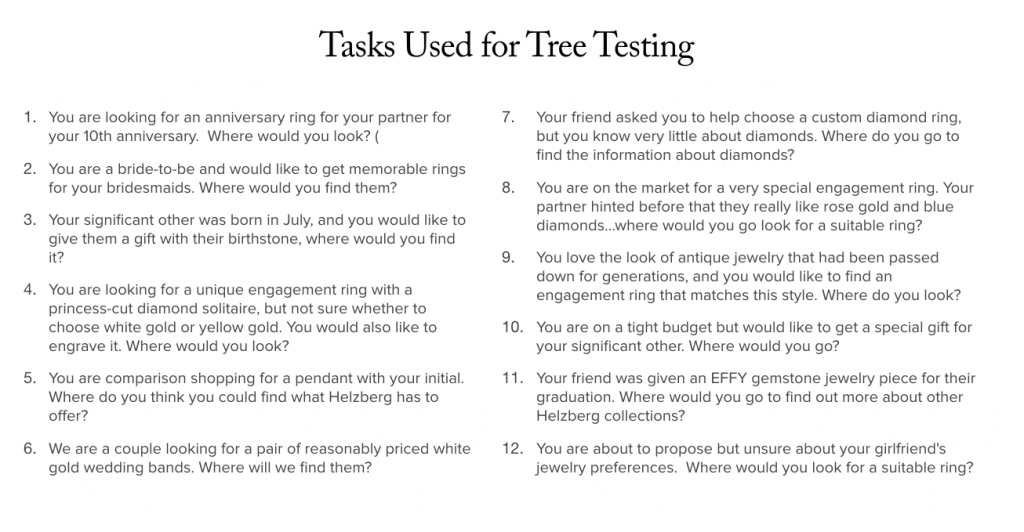
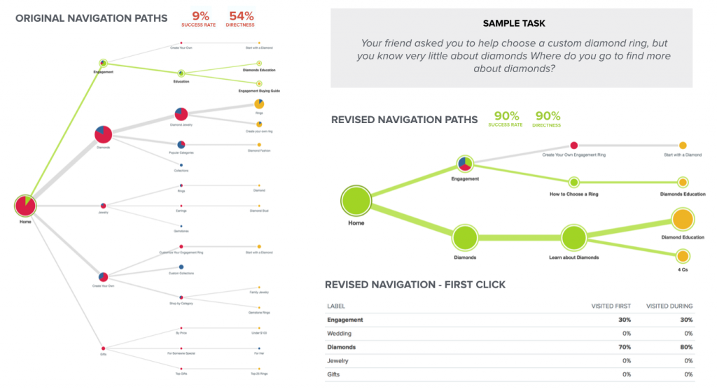
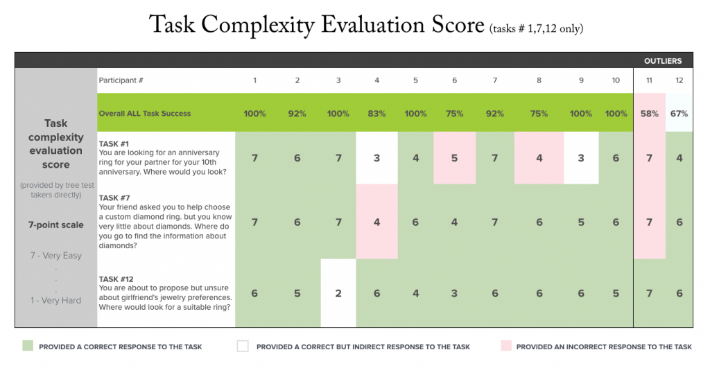
TREE TESTING
Collecting & Analyzing Data
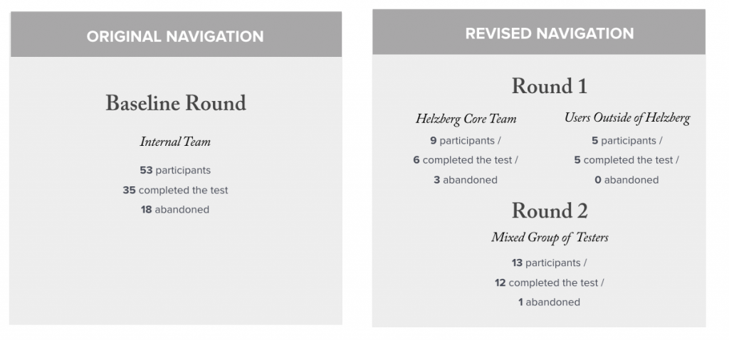
To evaluate how the proposed navigation would perform in real-world scenarios compared to the original one, we ran tree tests using Optimal Workshop.

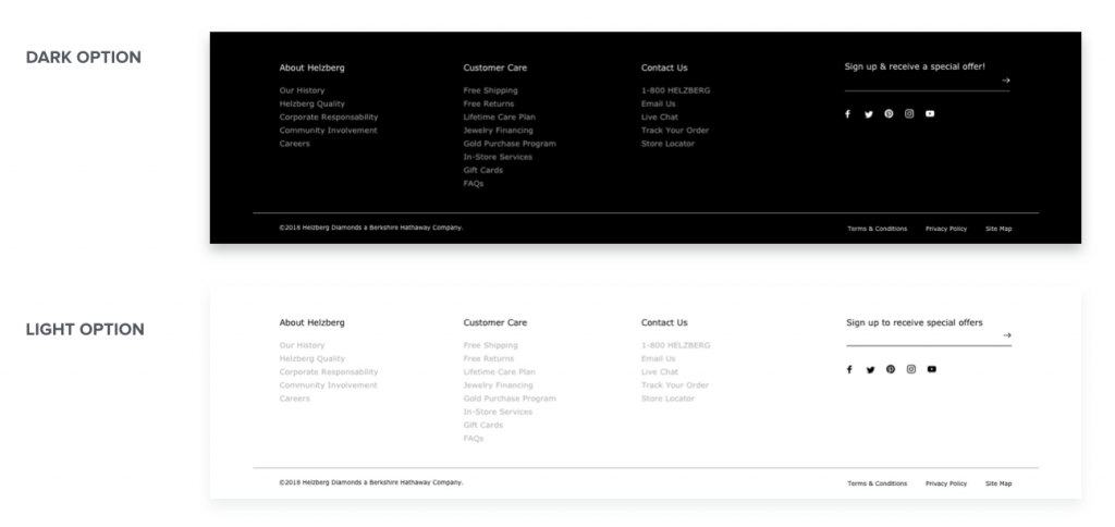
Footer Navigation

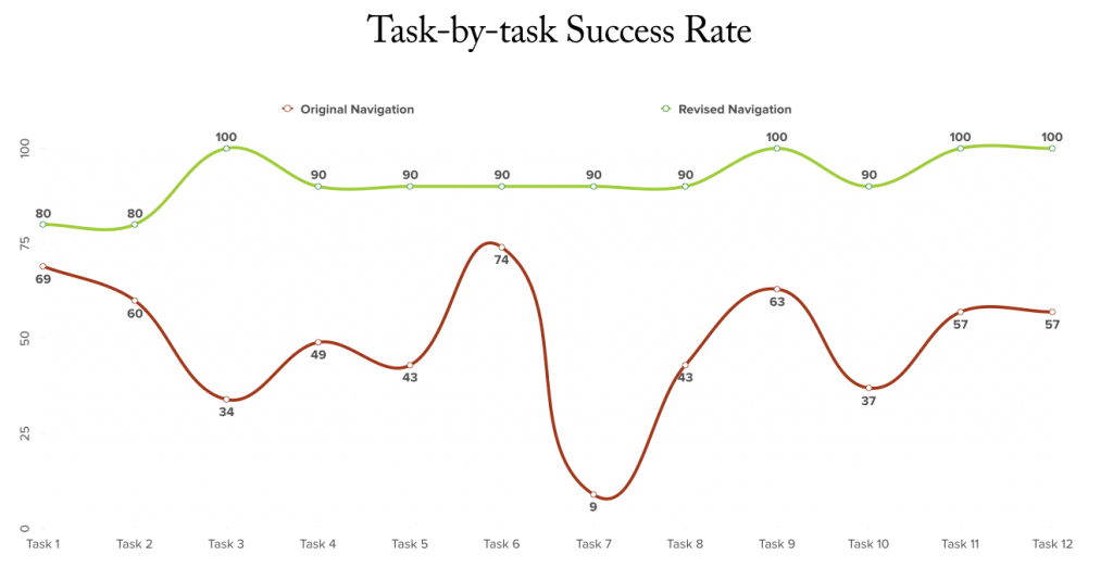
RESULTS & CONCLUSIONS
Revised Navigation: Conclusions
The testing showed that the proposed navigation was supporting a variety of user tasks and modes of information seeking significantly better than the original one.
Key features of the revised navigation–
- Reduced the number of top-level categories to simplify scanning.
- Clarified navigational groupings to promote clear interactions.
- Ordered the top-level categories to favor bridal customers and gift buyers.
- Designed for responsive compatibility.
- Incorporated iconography to provide visual cues and improve intuitive pathfinding.
- Eliminated duplicate links (unless items equally expected in both categories).
The result: based on the outcomes of this “pilot” project, the client felt assured and selected the agency for the full site re-platforming and redesign – a project with $1.7M budget.