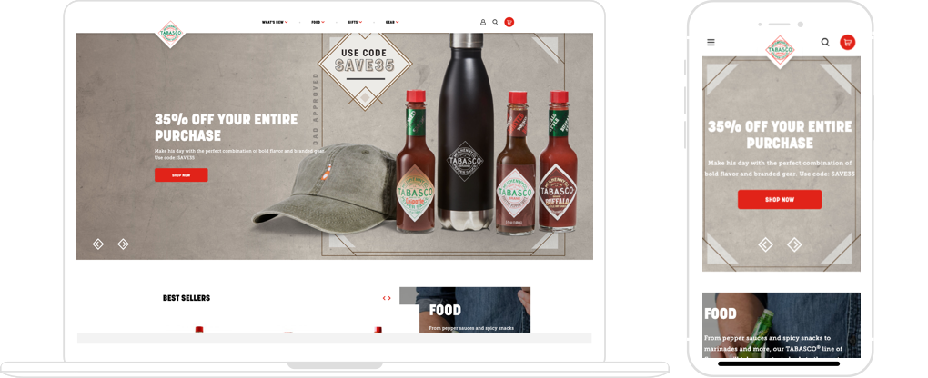
TABASCO® Brand products are sold in more than 180 countries and territories around the world. But when it comes to deals and hard-to-find products, pepper sauce fanatics know to turn to the TABASCO Country Store®, the official source to buy TABASCO products and gifts online.
With ferocious competition from established and up-and-coming contenders, the TABASCO brand needed to modernize its e-commerce store to stand out in a marketplace saturated with options.
CHALLENGE
How Might We Make Checkout Effortless?
After redesigning and launching the flagship site Tabasco.com, the brand came to my agency needing to redesign their e-commerce store: CountryStore.TABASCO.com that fell behind times visually and technologically. The metrics have shown that the cart abandonment rates have been steadily increasing while user satisfaction has been declining.
REVIEWING DATA
Traffic & Engagement
- ~ 37,000 visits per month.
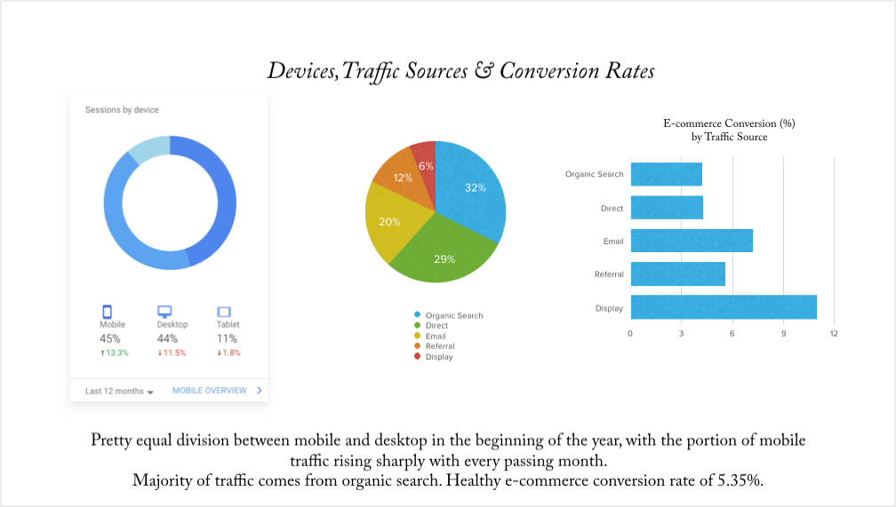
- E-commerce conversion rate -5.35%.
- Average visit – 2 min 41 sec.
- 7.67 pages viewed per session.
- 32% or traffic is organically generated.
- Social media engagement is very low.
REVIEWING DATA
Baseline Analytics
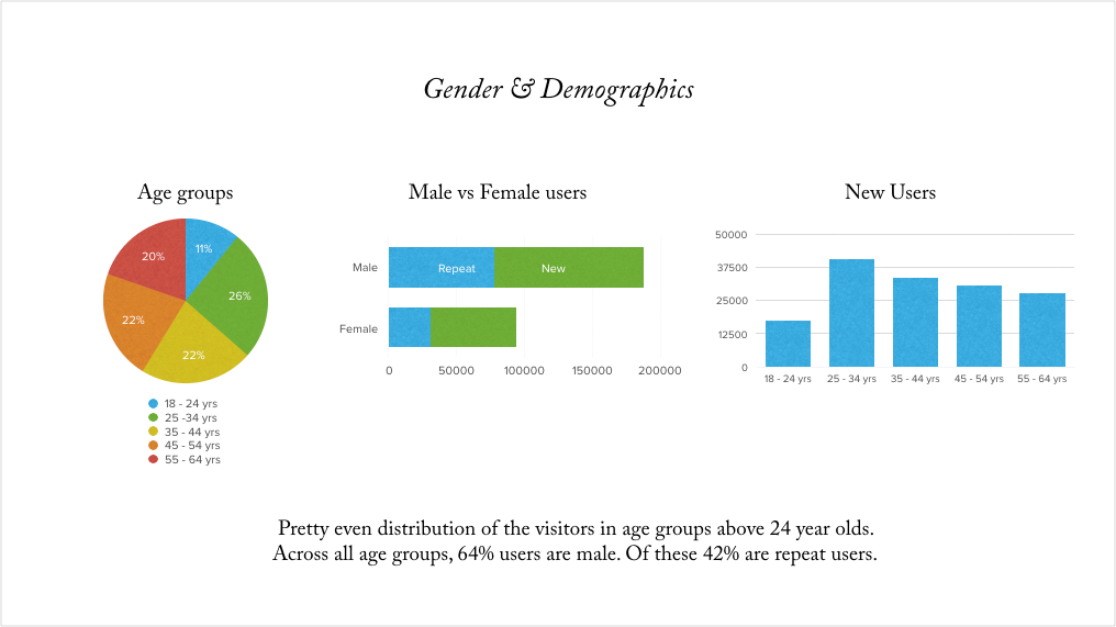
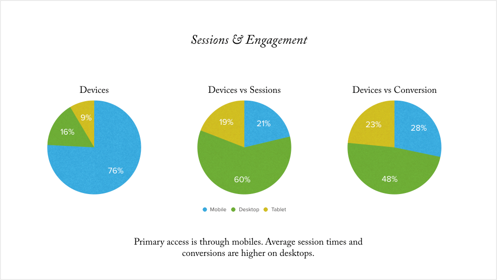
To better understand user engagement patterns, we reviewed and analyzed Google Analytics data (04/2017-04/2018).
REVIEWING DATA
Audience Segmentation
With an aggressive timeline to launch, we needed to heavily rely on the existing research data into user preferences and behaviors. The digital marketing agency that has been working with TABASCO for many years and assisted in the redesign of their flagship site, shared their additional research into audience segmentation with us. We were advised that TABASCO Country Store® audience can most effectively be broken down into four segments. While there is some overlap in consumers between segments, these groups identify key features of customers including average order value, level of engagement and key motivators.
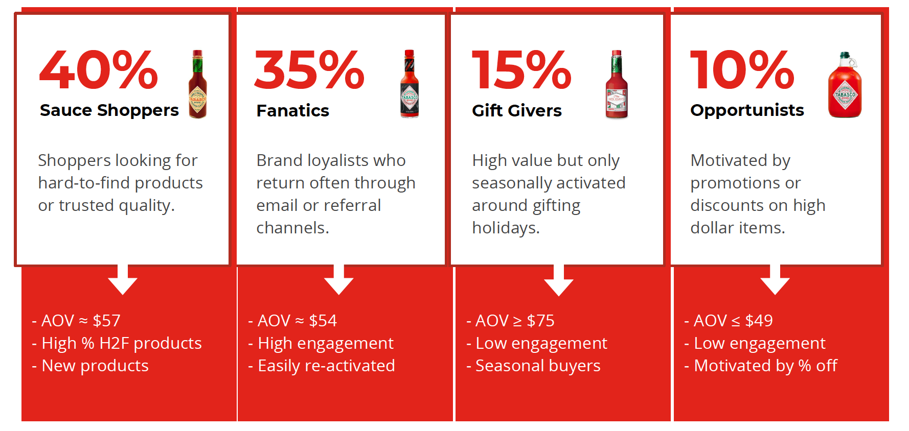
(based on marketing data)
CUSTOMER JOURNEY - Current State (04/2018)
The Path to Loyal Customers
When you think about ketchup you think Heinz, and when you think hot sauce you think Tabasco.
But why? To be sure, Tabasco isn’t the hottest sauce out there. Nor is it the costliest, and it’s surely not the rarest (the brand’s four factories crank out 700,000 bottles a day). But Tabasco is the oldest of the hot-sauce brands—the pioneer. And it’s kind of like a gateway sauce. It’s usually the first sauce people try, and it’s ingrained in their memories.
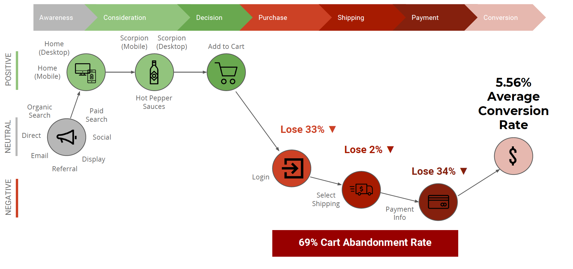
(based on data received from a third party)
We discovered that major customer pain points were related to the cart and checkout process, inability to check out as a guest, inability to shop cross-device; and slow/problematic payment processing.
USER FLOWS
User Flows
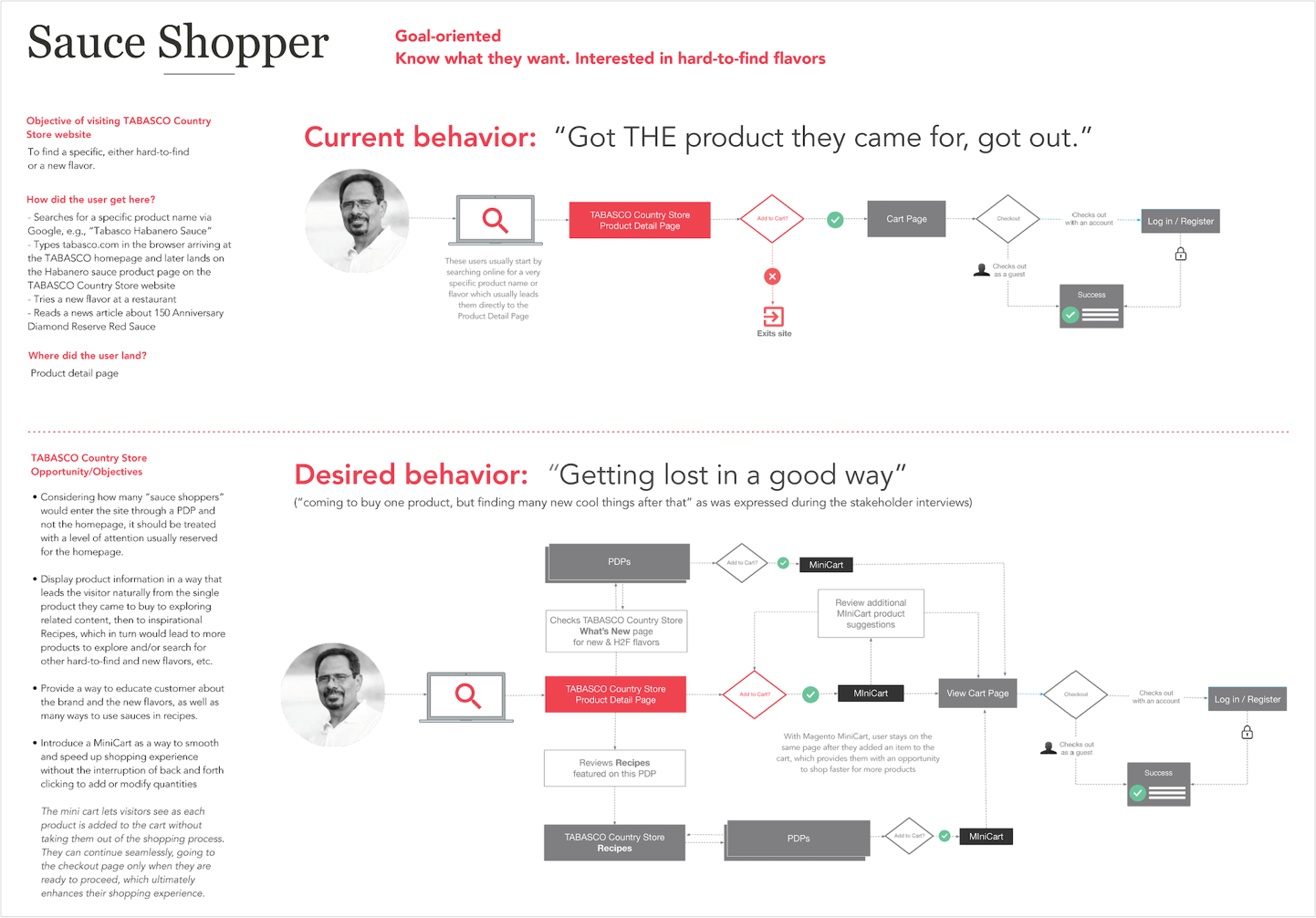
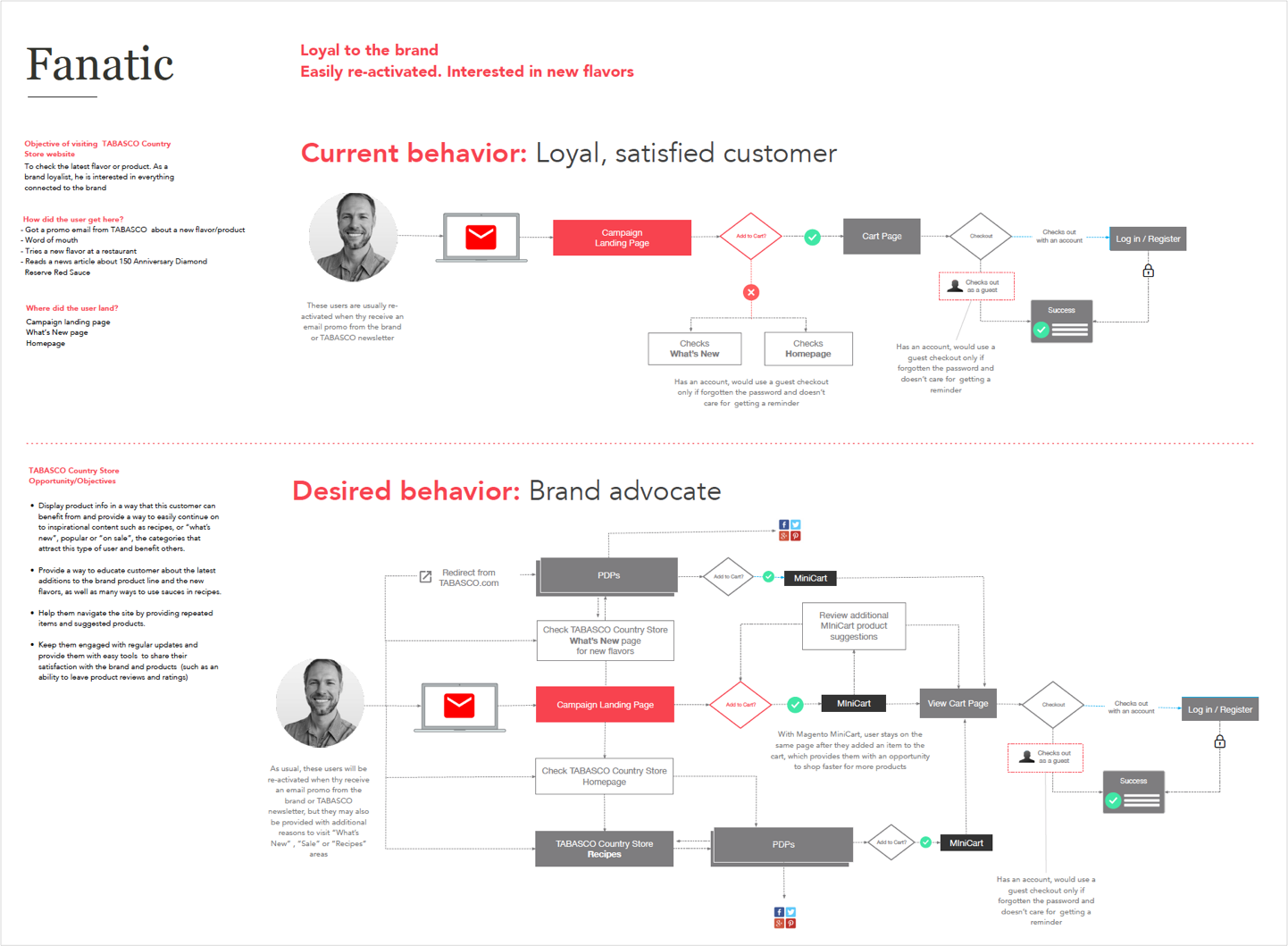
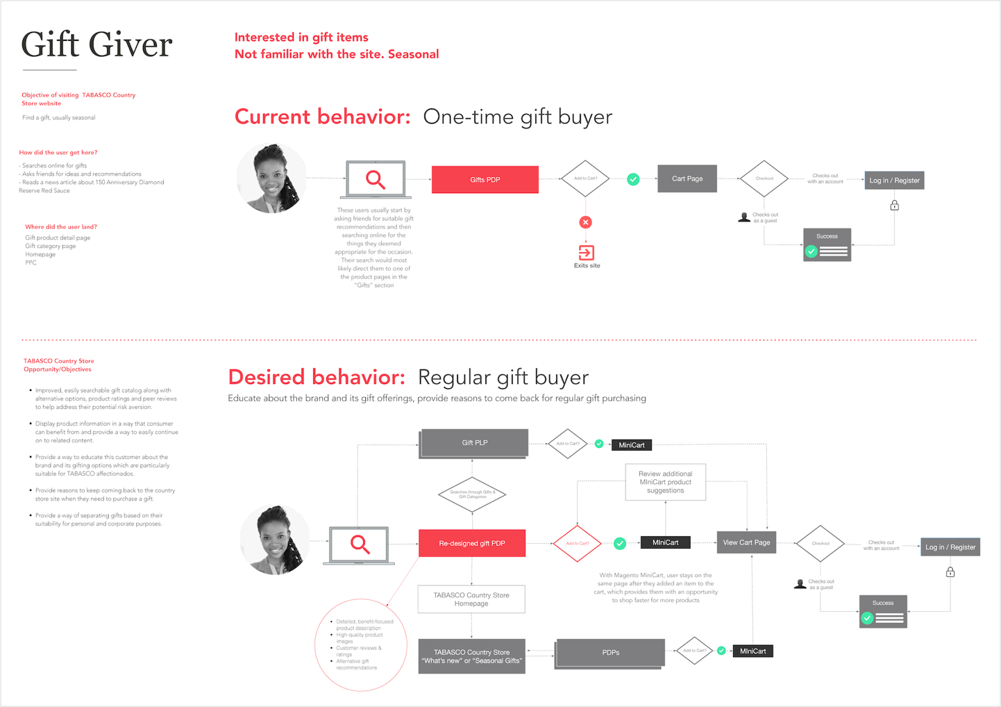
The user flows below depict the three personas accounting for 90% of the audience, their needs and their journeys, as we have defined them during the kick-off and validated during interviews. These flows informed creation of the store site map and template inventory ensuring that the site information architecture serves the needs of TABASCO’s target users.
KEY MESSAGING
Consistent Messaging Across All Platforms
According to a recent study, consumers seeing a consistent message across multiple channels increase their purchase intent by 90% and improve their perception of that brand by 68%. Sending out messages across both traditional and digital channels resulted in a greater return on their marketing investment.
Three key points of TABASCO messaging–
Product First
Focus on sauce first and gifts second. All promotions or themes should have a flavor focus.
Exclusivity
The official source for all TABASCO® Brand products and gifts. Members gain exclusive promotions and access to hard-to-find sauces.
Stock Up
Encourage users to buy more and often. Utilize deals and order thresholds to encourage increased order value.
INFORMATION ARCHITECTURE
Sitemap
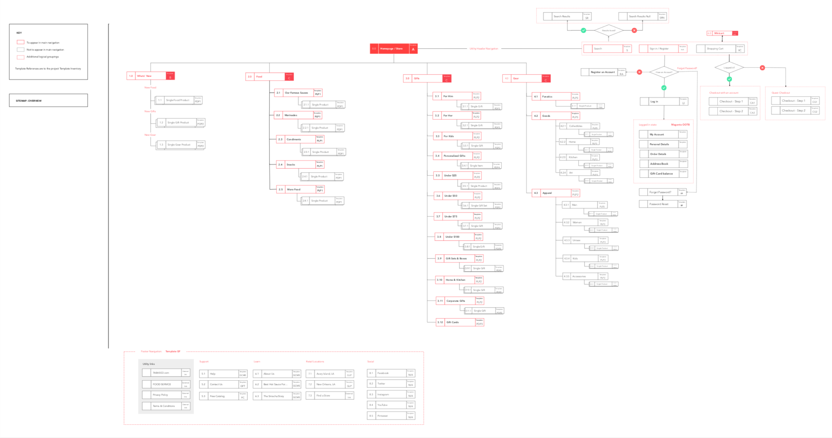
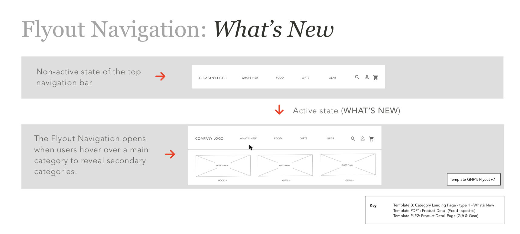
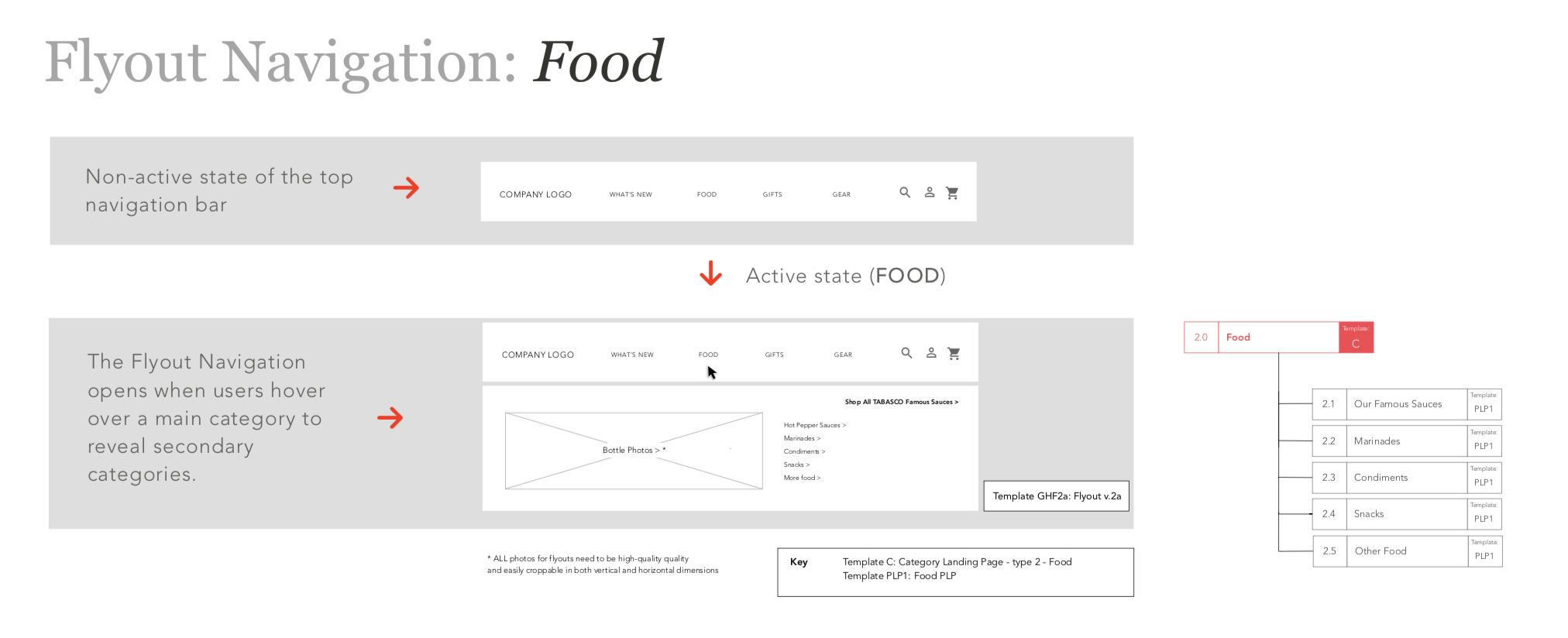
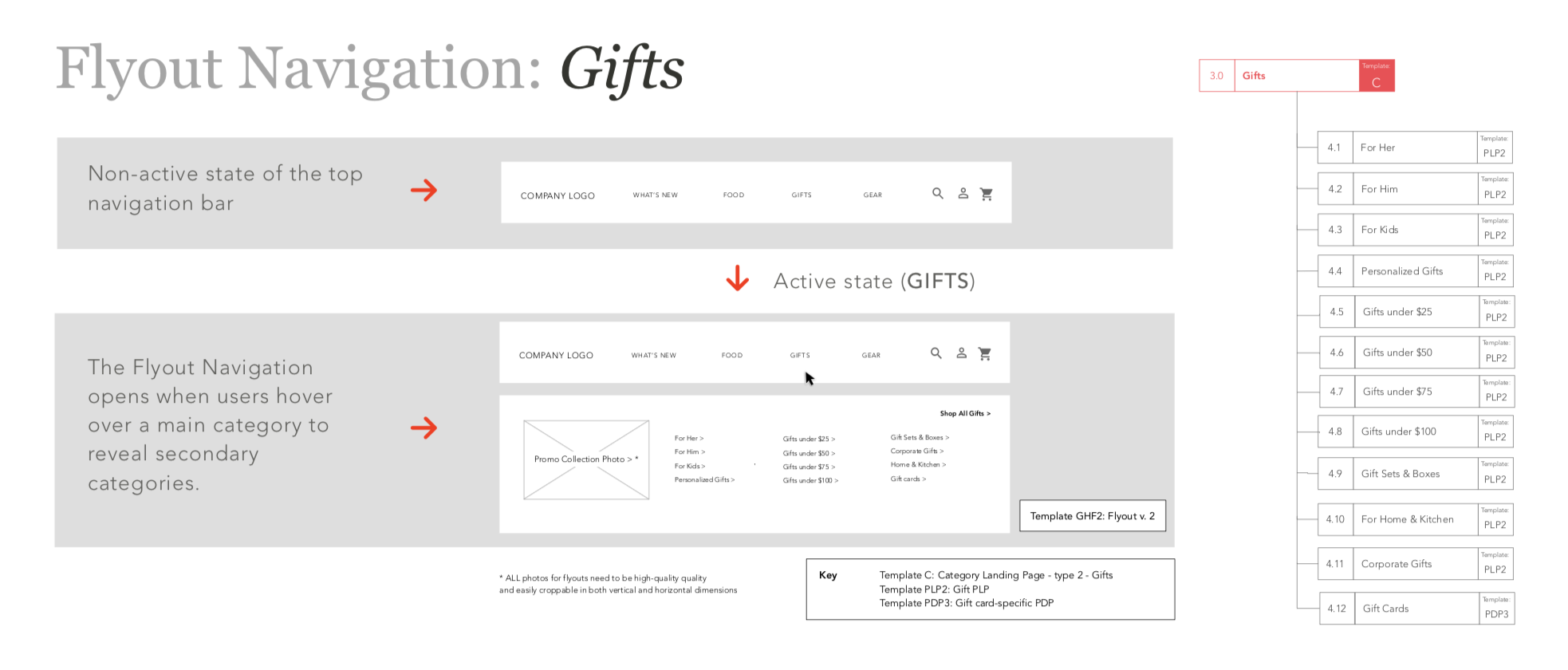
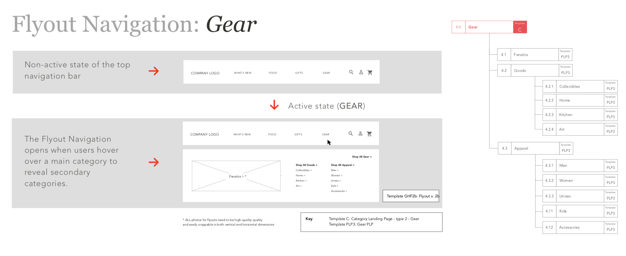
A site map is like a floor plan. It offers a visual representation of the site’s organization and how it’s different sections are linked together. Sitemaps help illustrate the navigational structure. They identify where content will live and show the relationship between different pages.
To aid understanding, we will look at two presentations of this information. One provides a better overview and sense of the relationship between pages. The second provides a better sense of how that could translate into navigation.
WIREFRAMING
Bringing It All Together
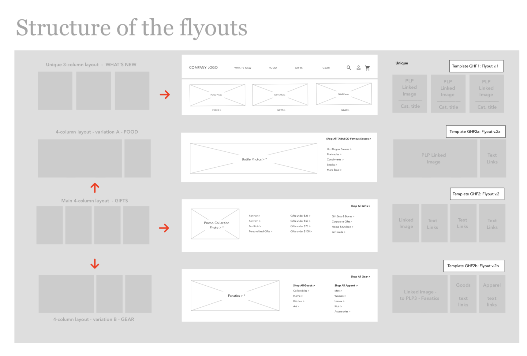
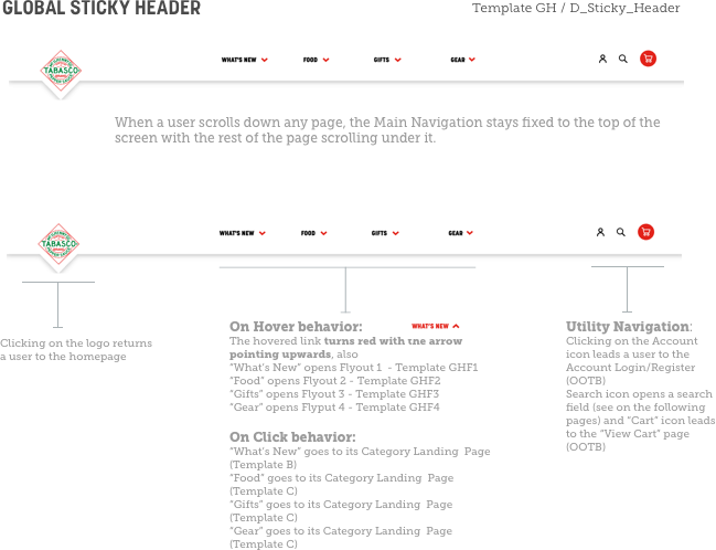
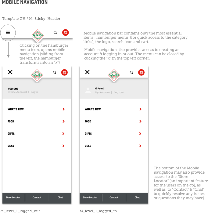
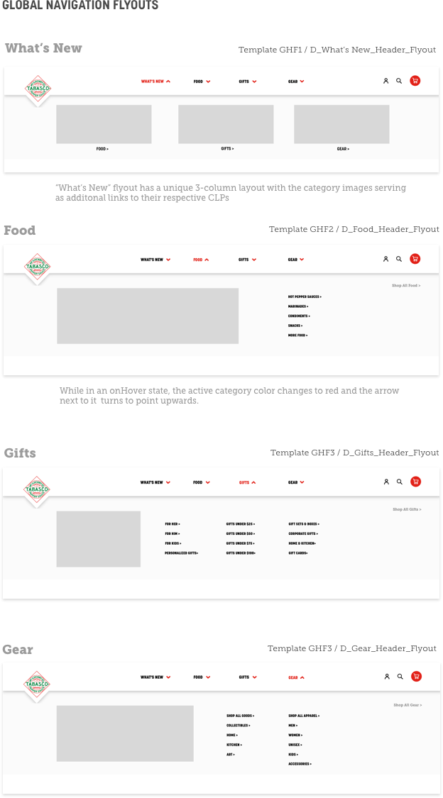
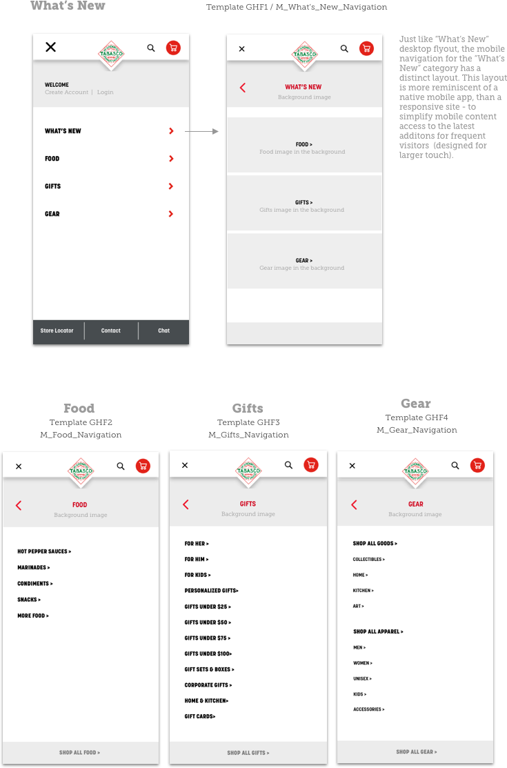
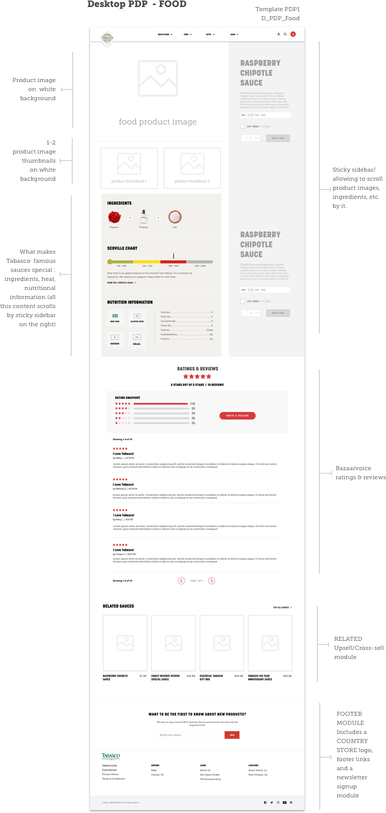
Wireframes allowed us all to sync our understanding on the element placement on each screen.
In the case of TABASCO Country Store, seeing the wireframes and the wire-based prototype, reassured the client about the future site staying visually and structurally consistent with other brand sites while also allowing for iterative variations prior to the beginning any actual design work.

NEXT STEPS
Blending Content & Commerce
Sauce calculator: Enter the RSVP count for your party and we will give you the amount of Sauce you need
Gift Guides: Provide a gift giving guide when seasonally appropriate.
Curate Collections for a more targeted shopping experience.
Enhance the Product Finder: Allow for product comparison
Create Viral Content: Tease articles that we know will go viral. For example “17 Problems Only a Hot Sauce Lover Will Understand”
